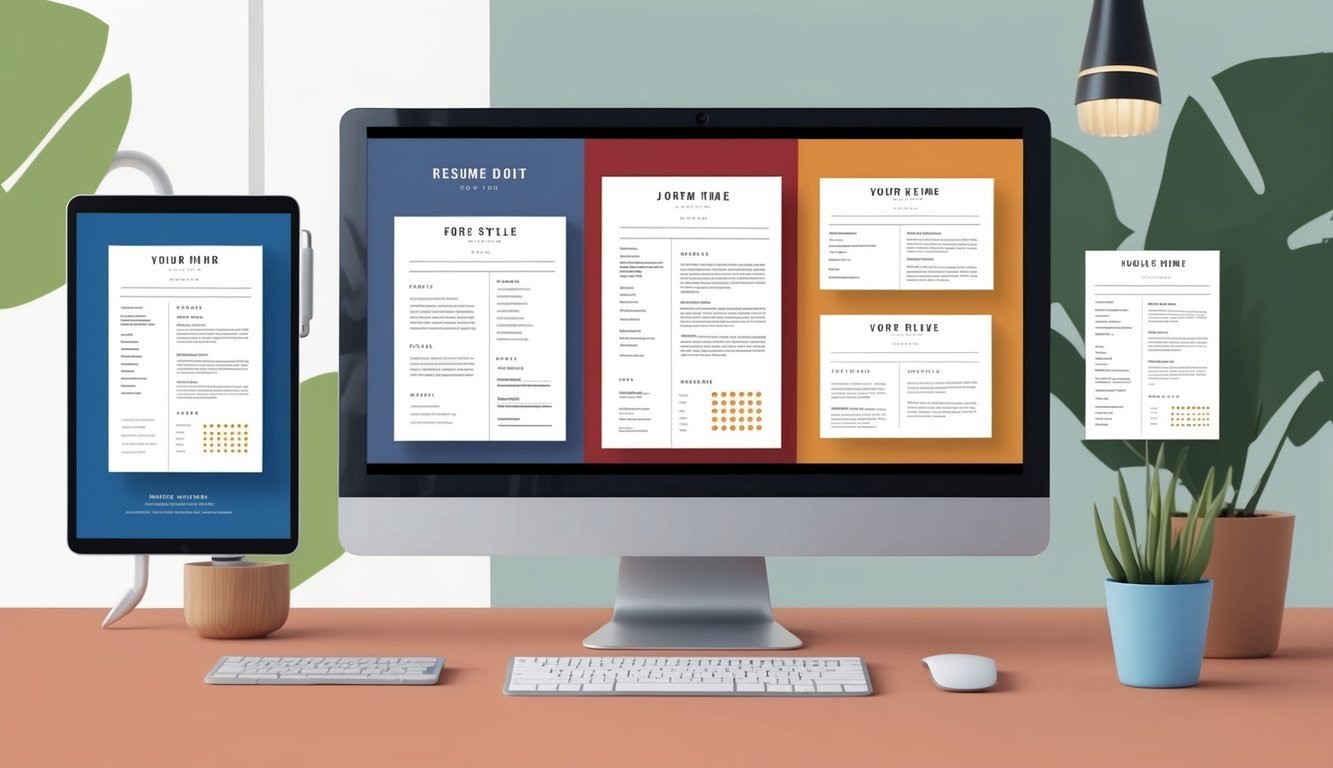
Selecting the Ideal Resume Font
Choosing the right font for your resume is crucial in making a positive first impression.
The font affects readability and how professional your resume appears.
Consider both the style and legibility when selecting the ideal font.
Understanding Serif and Sans-serif Fonts
Fonts are generally categorized into two types: serif and sans-serif. Serif fonts like Times New Roman and Georgia include small lines at the ends of strokes.
They convey tradition and reliability, often favored in formal settings.
Meanwhile, sans-serif fonts, such as Arial, Calibri, and Helvetica, lack these embellishments and project a modern and clean appearance.
When deciding, think about the industry you’re targeting.
Creative fields may welcome playful fonts, while conservative sectors prefer classic choices.
Your font choice should reflect your personal brand while being suitable for your profession.
Evaluating Font Legibility and Professionalism
Legibility is essential in resume writing.
The font should be easy to read at a glance.
Opt for sizes between 10-12 points; smaller text can strain the eyes.
A clean layout enhances comprehension, so avoid overly stylized fonts.
Professionalism is key.
Stick to commonly recognized fonts that convey seriousness.
For instance, Arial and Calibri are widely accepted in modern business environments, ensuring readability.
Avoid decorative or script fonts, which can distract from your qualifications.
Top Resume Fonts to Consider
Here are some of the best fonts for a resume based on their professional appearance and legibility:
| Font | Type | Notes |
|---|---|---|
| Arial | Sans-serif | Clean and modern, great for any industry. |
| Calibri | Sans-serif | Default in many applications, easy to read. |
| Helvetica | Sans-serif | Highly professional, widely used globally. |
| Garamond | Serif | Elegant with a classic touch. |
| Times New Roman | Serif | Traditional and respected in formal contexts. |
| Cambria | Serif | Designed for clarity in digital formats. |
| Georgia | Serif | Stylish yet legible, suitable for web use. |
Choose a font that aligns with your industry while ensuring it reflects your personal style.
Optimizing Font Size and Formatting
Choosing the right font size and ensuring consistent formatting are essential for creating an effective resume.
These elements impact readability and the overall impression your resume leaves on potential employers.
Determining the Appropriate Font Size for Readability
For your resume, maintaining readability is crucial.
A font size between 10 to 12 points is typically recommended.
This range ensures that your text is easy to read while fitting necessary information on a single page.
When using smaller font sizes, be cautious.
If the text is difficult to read, it can put off hiring managers.
Use 12 points for your main text and consider 14 points for headings or section titles.
Testing your layout with different sizes is wise.
Print your resume and view it from a normal distance.
This way, you can determine if adjustments are needed for clarity.
Consistency in Resume Formatting
Consistency across your resume’s formatting enhances its professionalism.
Choose one or two professional resume fonts, such as Arial, Helvetica, or Calibri, and use them throughout.
Ensure that your font sizes are uniform for similar sections.
For instance, all job titles might use a bold 12-point font, while company names could follow suit in a consistent style.
Using bullet points is another effective way to maintain visual consistency.
Lists help break up chunks of text and facilitate quick reading, especially for HR professionals who often scan resumes.
Integration with Resume Templates and Builders
Many effective resume templates and builders offer pre-set formatting and font pairings.
These resources can save you time while ensuring a polished outcome.
When using these tools, choose templates that allow customization of font sizes.
For optimal results, ensure that the template’s font size aligns with your intended design.
Pay attention to spacing and margins, which affect how your content fits without clutter.
Finally, always preview your document before finalizing it.
This review helps ensure that your resume appears professional and adheres to best practices for formatting and readability.
Avoiding Common Font Mistakes
Choosing the right font for your resume is crucial for making a positive impression.
Certain font choices can negatively impact how your resume is perceived.
Focus on maintaining professionalism and clarity throughout your application.
Fonts That Detract from Professionalism
Some fonts are widely recognized as unprofessional and should be avoided. Comic Sans tops the list, often criticized for its childish appearance.
Other fonts such as Papyrus and Curlz MT also fall short in professional settings.
Sticking to classic fonts like Arial, Times New Roman, or Calibri ensures your resume is taken seriously.
These fonts enhance readability and project a polished image.
Avoid decorative or overly stylized fonts that distract from your qualifications.
Impact of Font Choice on Resume Content
Your choice of font significantly affects how employers perceive your qualifications and professionalism.
An inappropriate font may overshadow your skills and achievements, making it harder for hiring managers to focus on what matters most.
Using a legible 10 to 12-point font size ensures your content is accessible.
Consider that some Applicant Tracking Systems may struggle to read unconventional fonts, potentially preventing your resume from getting noticed.
Aim for simplicity and clarity to enhance your opportunity for interviews.
Additional Considerations for Digital Submission
When submitting your resume digitally, consider how your font choice appears on various devices.
Fonts can render differently across platforms, which might alter the overall look of your document.
Save your resume as a PDF to maintain its appearance regardless of the software being used.
Ensure that your selected font remains consistent, avoiding any font that could shift during another user’s viewing.
Choosing a professional font will make your job application more approachable and appealing.
Frequently Asked Questions
Selecting the right font for your resume can significantly influence how your application is perceived.
There are several key considerations regarding font choice, size, and style that can enhance readability and professionalism.
What is the most professional font for a resume?
The most professional fonts for a resume include Arial, Calibri, and Times New Roman.
These fonts are widely accepted in various industries and offer clarity and a clean appearance.
Which font size is recommended for optimal readability in a resume?
A font size of 10 to 12 points is generally recommended for resume text.
This size ensures that your content is easy to read while allowing you to fit necessary information without overcrowding the page.
Are sans-serif fonts more suitable for resume formatting?
Sans-serif fonts such as Arial and Helvetica are often preferred for digital resumes because they appear cleaner on screens.
These fonts help maintain readability and professionalism, especially in online applications.
Is Calibri considered an appropriate font for resume creation?
Yes, Calibri is considered an appropriate font for resume creation.
It is modern and easy to read, making it suitable for professional documents in many fields.
What are the best font choices for a resume when using Microsoft Word?
In Microsoft Word, effective font choices include Calibri, Arial, and Georgia.
These fonts provide a balance between professionalism and readability, making them effective for various job applications.
How do font choices impact the overall perception of a resume?
Font choices affect how hiring managers perceive your professionalism and attention to detail.
A clean, well-chosen font can make a strong impression, while inappropriate, overly stylized fonts may detract from your qualifications.